CASE STUDY
Redesigning the Stock Allocation & O/S Listing Experience
UI Redesign
Prototype
Duration
Dec 2024 - Jan 2025

About the project
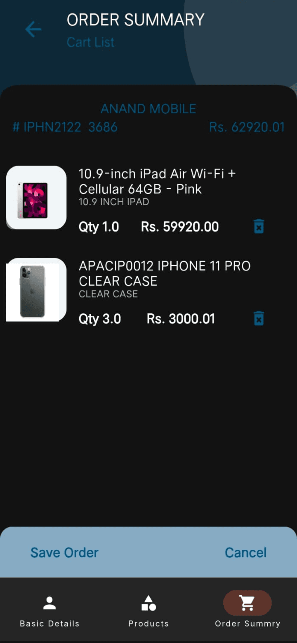
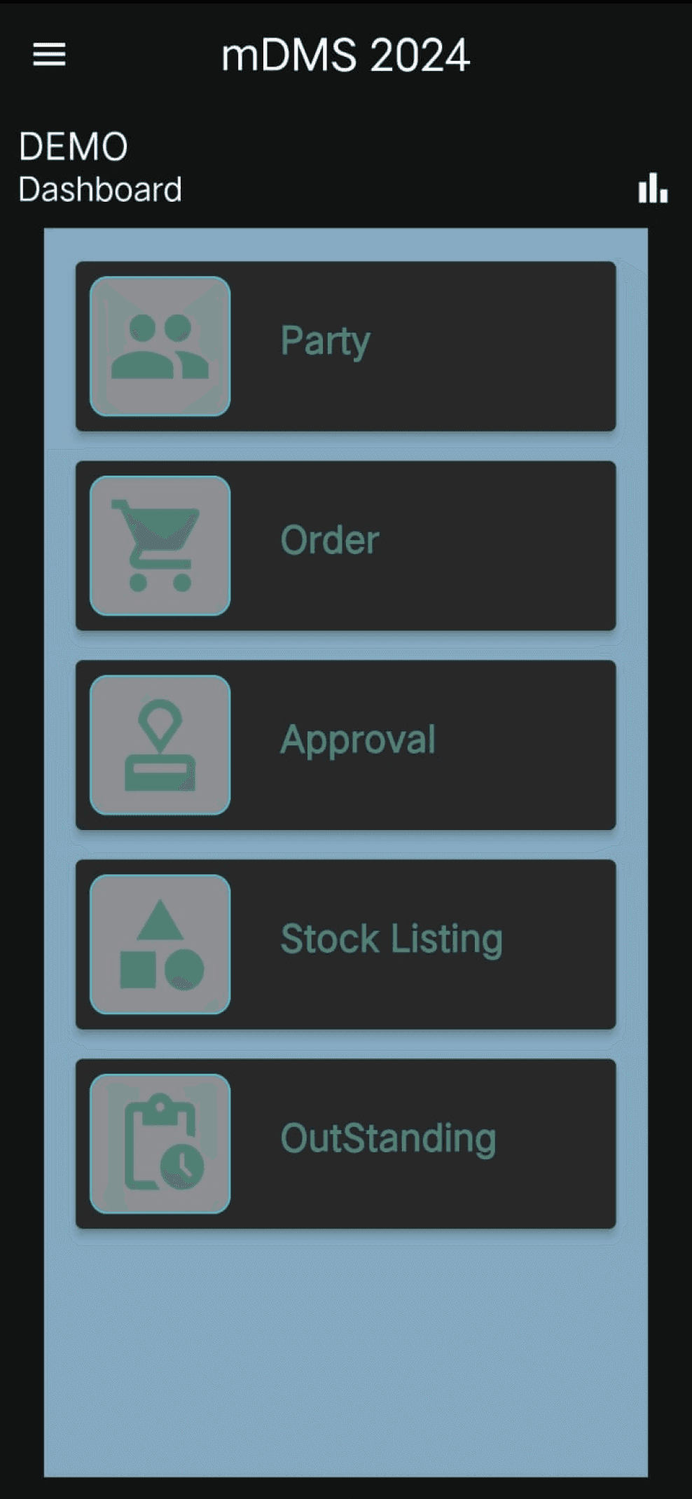
This project focused on redesigning core screens of the HVCI app, a stock booking and order management platform used by retailers and sales teams. The existing UI was cluttered, confusing, and hard to navigate. Our goal was to simplify workflows, enhance clarity of financial and stock data, and create a more intuitive experience through clean layouts, structured cards, and smart visual hierarchy — all while maintaining brand consistency.
Client

Tools
Figma, Notepad
Role
UI/UX Designer
Team
Saiprasad Chandran
“The experience felt like reading a spreadsheet in a moving
auto-rickshaw — everything shaking, nothing clear, and no sense of direction. This redesign was about bringing order to the chaos.”
Where the Old Design Failed


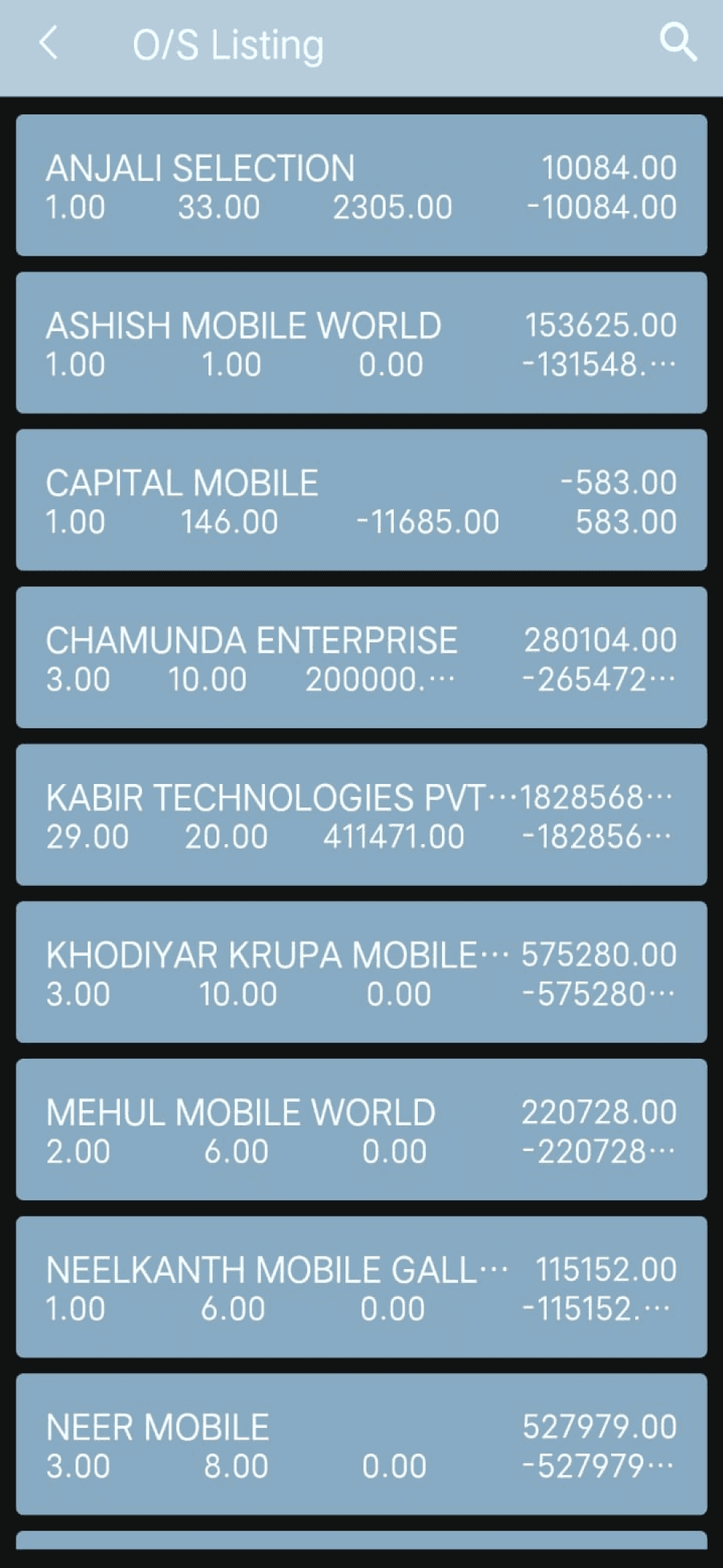
OLD UI
Menu options were not clearly categorized.
Excessive scrolling was needed to find key actions.
Poor Navigation
Users found it difficult to locate essential functions such as stock listings, outstanding orders, and approvals.
No clear grouping of related actions or data fields.
Users spent extra time scanning the interface.
Alignment and Visual Hierarchy Issues
The lack of structured layouts made it difficult to distinguish between important and secondary information.
Insufficient white space.
No emphasis on high-priority actions.
Poor Readability and Cluttered Layout
Text was small, poorly spaced, and often blended into the background, making it hard to read and process information quickly.
Designing a Better Experience
New Layout
Structured grid layout
Bold headings & grouping
Visual separation with cards
Clear tabs and action buttons
Readable typography & spacing


We chose Lexend for its clean, wide-set letterforms that enhance legibility and reduce visual fatigue—perfect for a data-heavy interface. The font supports fast scanning and a smoother reading experience, especially for users who need to act quickly.
Lexend

